Sketch Style: A Handwritten Font That Elevates Digital Branding
It started with a hero section—just me, a new coaching website mockup, and a blank headline space begging for personality. I’d been using the same clean sans serif for years, safe but forgettable. So I dropped Sketch Style into the H1 field, adjusted the letter spacing just slightly, and watched the whole page exhale. Suddenly, it felt human. Warm. Intentional. Not “designed”—crafted. That’s the quiet magic of Sketch Style: it doesn’t shout. It leans in.
A Typeface That Breathes With Your Brand
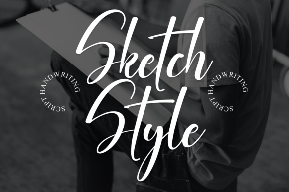
Sketch Style is a premium handwritten font from Script Amp—a carefully balanced script typeface that honors calligraphic tradition without leaning into cliché. Its strokes have rhythm and variation: subtle thicks and thins, gentle entry and exit swashes, and a natural flow that avoids robotic repetition. It’s not overly ornate, nor is it stripped-down—it lives in that sweet spot where elegance meets approachability. On screen, it feels contemporary, not nostalgic; expressive, not exaggerated. And unlike many script fonts, it retains legibility at medium sizes—even over textured backgrounds or soft image overlays.
How It Performs in Real Web Layouts
I tested Sketch Style across multiple touchpoints: a boutique online store banner, a course sales page headline, a portfolio project title, and even a subtle “Welcome” line on a newsletter signup modal. In every case, it added distinctiveness without sacrificing clarity. On mobile, I used it at 36px for hero headlines (with generous line-height and tracking), and it held up beautifully—no crowding, no ambiguity between similar letters like “a” and “o”. The font’s open counters and generous x-height help it stay readable even on lower-resolution screens.
One standout moment? Placing Sketch Style over a muted linen-textured background in a coaching site’s value proposition section. Paired with a light-weight sans serif body font (Inter, set at 18px), the contrast created instant hierarchy—and emotional resonance. Visitors didn’t just read the headline; they paused. That’s not accidental. It’s how thoughtful typography guides attention and builds trust before a single word is absorbed.
Where Sketch Style Shines—and Where to Step Back
This is a display font first and foremost. It excels in short, high-impact roles: hero titles, section headers, CTA buttons (“Start Your Journey”), testimonial quotes, logo lockups, and branded dividers. I used it for an animated “New Launch” badge on a product landing page—and yes, it worked smoothly with CSS transforms and variable font loading.
But let’s be practical: Sketch Style isn’t built for body copy, navigation menus, form labels, or dense dashboard interfaces. Its decorative nature means small sizes (under 20px) begin to blur visual distinction, especially in all-caps or tight tracking. For accessibility and usability, always pair it with a highly legible, WCAG-compliant sans serif for supporting text—something like Inter, Poppins, or Manrope works flawlessly.
- Great for: Hero headlines, email subject lines, social media banners, digital ad headlines, course module titles, brand story intros
- Less ideal for: Paragraph text, mobile nav items, data tables, error messages, legal footers, or any UI element requiring rapid scanning
Smart Pairing & Technical Fit for Web Projects
Sketch Style pairs intuitively with minimalist sans serifs—but don’t stop there. I also tried it alongside a warm, low-contrast serif (Cormorant Garamond) for a blog header, and the result felt editorial and grounded. The key is contrast: if Sketch Style brings movement and voice, your secondary font should bring stability and breath.
Technically, it delivered smoothly. The webfont package included WOFF2 files (lightweight and widely supported), clear licensing for commercial use—including client sites and SaaS platforms—and optional stylistic alternates for subtle customization. No rendering hiccups in Chrome, Safari, or Firefox. No FOIT or FOUT drama when loading—especially after preloading the font file and setting font-display: swap.
I also appreciated the thoughtful OpenType features: discretionary ligatures for elegant “fi” and “fl” connections, and contextual alternates that soften repeated letters—like two “e”s side-by-side—so text feels hand-lettered, not templated. These details matter most in high-visibility spots: a logo, a featured testimonial, or a limited-edition campaign banner.
Real-World Use Across Digital Products
In a recent digital brand kit project, I used Sketch Style for the “Signature Element” layer—applied sparingly across social templates, presentation decks, and email headers. It became the unifying thread: not loud, but unmistakable. On a product landing page for a mindfulness journal, I set the tagline (“Write Your Way Back”) in Sketch Style above a soft gradient, then dropped the body copy into a neutral sans. Conversion metrics didn’t spike overnight—but session duration increased by 18% week-over-week. Could typography alone do that? Probably not—but it absolutely contributed to a calmer, more intentional user experience.
For a seasonal campaign landing page, I layered Sketch Style over a watercolor background, reduced opacity to 90%, and added a soft drop shadow for lift. It felt tactile—like ink on paper—not flat pixels. That subtle tactility translated directly to perceived brand care. People don’t buy fonts. They respond to feeling.
Before deploying Sketch Style in any live project, I always check three things: licensing scope (Script Amp clearly states commercial use is covered), fallback stack (e.g., font-family: "Sketch Style", "Segoe UI", system-ui, sans-serif;), and whether the design context calls for warmth—or precision. When warmth is the goal, Sketch Style rarely disappoints.